

Photonics21 Rebrand
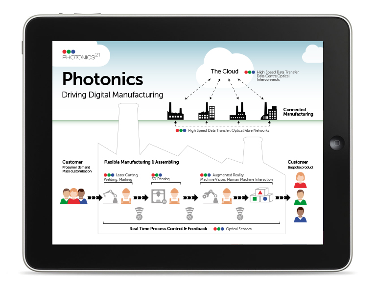
Photonics is all about light used in all areas of life, from manufacturing to healthcare. The Photonics21 Logo incorporates the three colours that make light: red, blue and green. We created a variety of vibrant graphic devices, made up of overlapping shapes in these primary colours, which they could use on all their marketing materials. When two colours overlap they create one of the secondary colours. When all three primary colours overlap, the colour becomes white (light). The identity is a big departure from all previous work and also represents the Photonics21 core values of being a transparent and inclusive organisation, where different groups of people come together to discuss ideas.
We also created a set of brand guidelines showing how the logos and graphic devices could be used along with fonts and colour palates.
10 Year Anniversary
For their annual general meeting we created a special presentation that was shown at the very start of the meeting. Working with a voice-over artist in a recording studio and giving art direction to video editors, we produced a five minute film which celebrates memories, programs, actions, and people involved from the very start of setting up the initiative, to the current structure and formulation of the Public Private Partnership. The film mixes still images, video graphics, music, voice-over, facts and figures to create an engaging and entertaining animated historical timeline.
Client: www.photonics21.org
Working with: www.ocean-design.com
