Leap London CIC
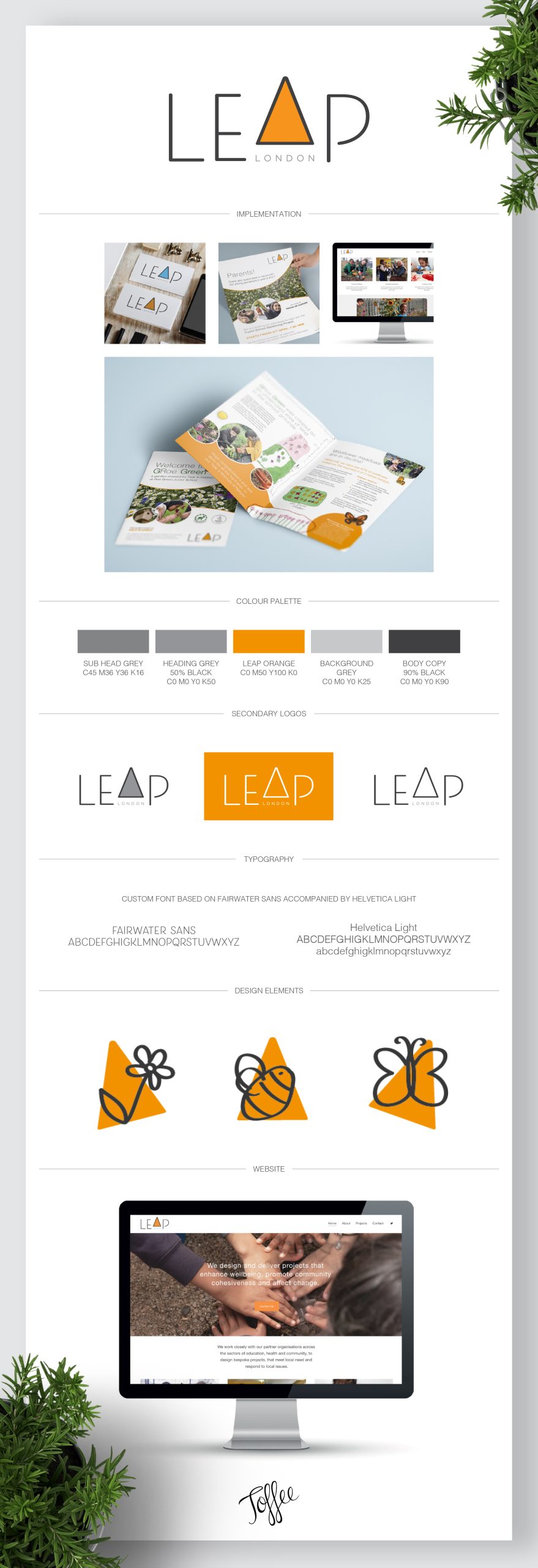
Leap London CIC design and deliver projects that enhance wellbeing, promote community cohesiveness and affect change. They work closely with their partner organisations across the sectors of education, health and community, to design bespoke projects, that meet local need and respond to local issues.
The client wanted something that was simple, contemporary and had a fun energy. The concept behind the logo was to represent the idea of jumping forwards. We achieved this by creating a custom font logo where the A is a triangle that looks like it is literally leaping up from the base of the text. This left a nice gap for the words “London” to sit underneath. The triangle is also a shape that we can use for things such as bullet points or background shapes.
The overall brand image is light and fun and where activities are aimed towards schools/children, we incorporate hand-drawings either drawn by ourselves for things such as icons for the website, or actual drawings by children for posters and leaflets.
Client: Leap London CIC
Sector: Not for Profit
Services: Logo Design, Poster & Leaflet Design & Squarespace Website Design


