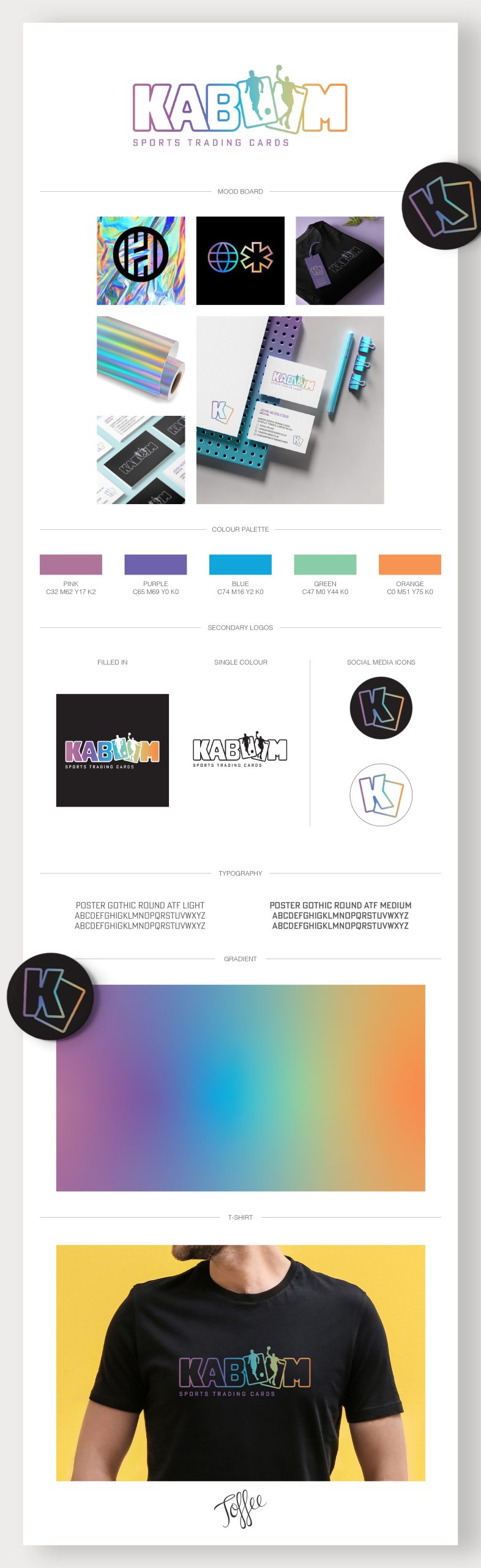
Kaboom Trading Cards Logo Design
This logo design features a custom designed font with rounded corners making the ‘O’s look like playing cards. Saying exactly what’s on the tin without the need for the strapline.
The letters have been designed to look like a stack of playing cards that have been fanned out, so that they slightly overlap each other.
The football and basketball players show that the client sells a range of sports cards and having them jumping out of the cards
gives the logo movement and makes it more dynamic.
The multi-coloured logo takes inspiration from the holographic look of some of the “special” cards. Having just the outline in colour makes the logo more contemporary and allows it to stand out without being garish.
We also designed a simplified icon that could be used for social media, as well as additional icons for the business cards to suit the same colour style.
Client: Kaboom Sports Trading Cards
Working with: Orion Design and Print
Sector: Sports
Services: Logo Design, Business Cards
