Gordon’s Gin POS Concept
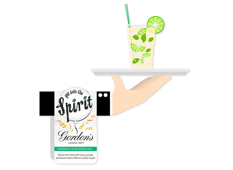
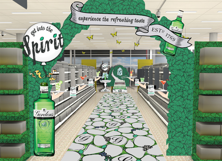
Concept for a shopper experience based on the idea of a botanical garden, to visually experience the refreshing taste of Gordon’s Gin. The key visual plays on the word spirit to give the feeling of a celebration, as well as literally getting to know the drink: “Get into the Spirit – experience the refreshing taste”. The design was implemented across aisle takeovers, aisle toppers, aisle fins, bottle neck tags, FSDUs, trolly decor and a fridge animation.
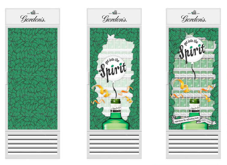
The fridge animation begins with a leafy design over the Gordon’s Gin cans. As the shoppers approach the fridge, the design breaks apart to reveal the products and at the same time the key visual ‘pops’ up, and the balloon floats upwards.
The free-standing display unit is an image of a fountain with the Gordon’s Gin bottle on the top, and the liquid flowing out of it. This emphasises the purity of Gordon’s Gin (as it is triple distilled) and compliments the concept of being a refreshing drink.

